the eye catcher
By Lia Bastos
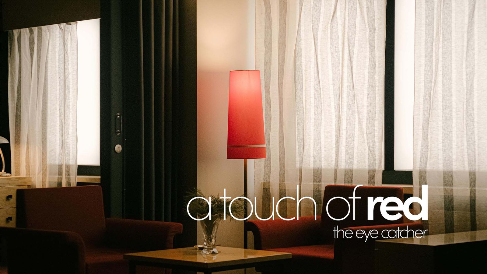
Have you ever heard about the unexpected red theory? “Basically adding anything that’s red,
big or small, to a room where it doesn’t match at all, and it automatically looks better,” says
Taylor Migliazzo Simon, the Brooklyn-based designer who first pointed it out in her viral TikTok
video that sparked a wave of fascination around the color in 2024. And that’s the thing about trends:
they can offer a fresh perspective on something familiar, like a color that has always been there,
waiting to be rediscovered.
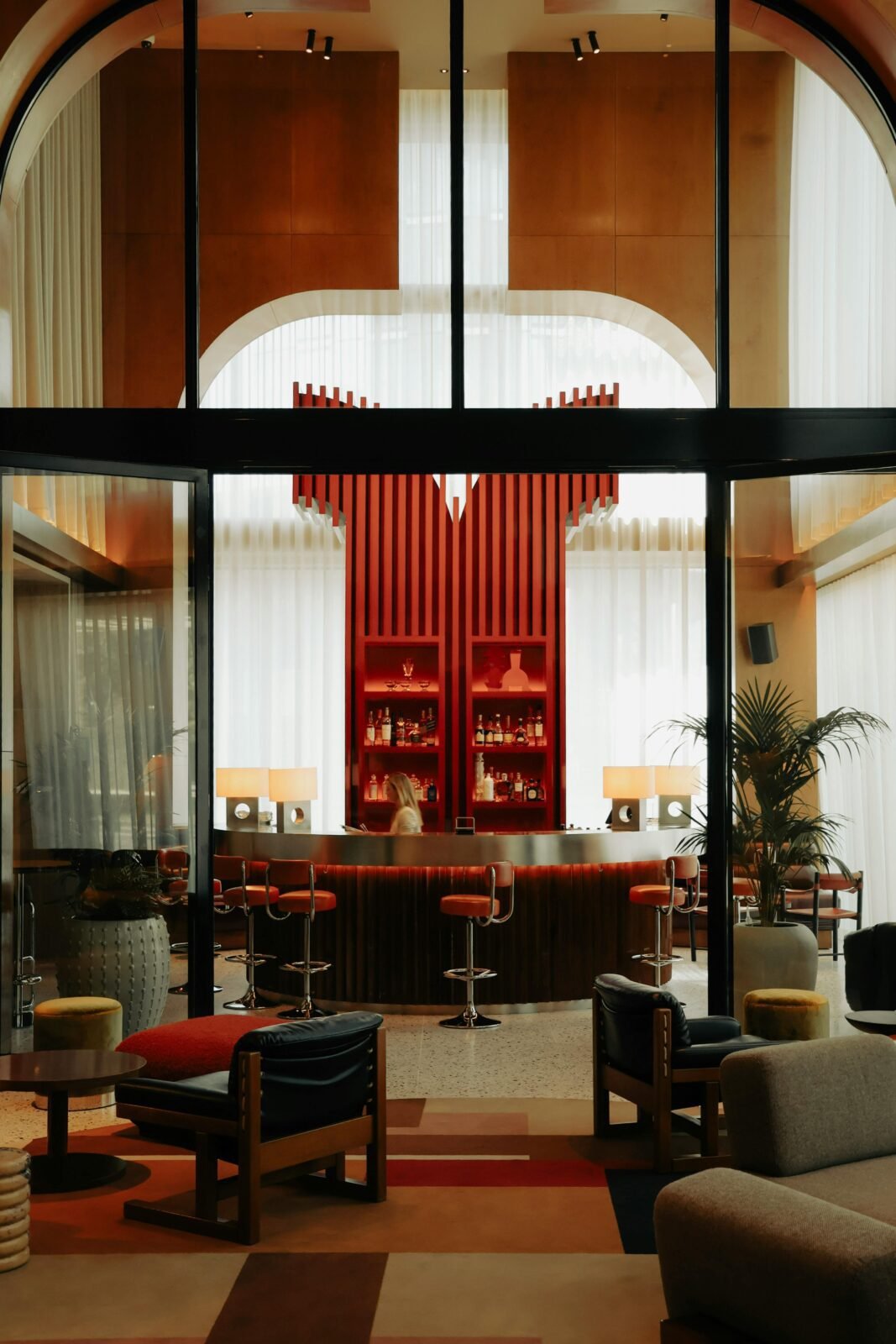
In interior design, colors can evoke emotions and set the tone of a space. Red, for instance,
can stimulate the appetite, create a sense of warmth, and serve as a natural focal point when
used intentionally. It can even act as a subtle conversation starter, especially when it catches
the eye of design enthusiasts who recognize its deliberate placement.
The secret lies in moderation. Red is a bold and commanding color, and balance is essential.
The key is to let it stand out as the central accent, the statement piece, while the surrounding
elements, such as warm wood furniture, neutral tones, or even a few complementary pops of color,
work in harmony to support it.
What makes red so fascinating is its ability to change how we experience a space. It invites energy,
stimulates connection, and adds a touch of personality that neutral palettes alone could never
achieve, and when used wisely, it demonstrates how design is as much about emotion as it is about aesthetics.
It draws attention, commands presence, and, when balanced, makes a room feel curated rather than chaotic.