Sherwin-William’s color of the year: Universal Khaki
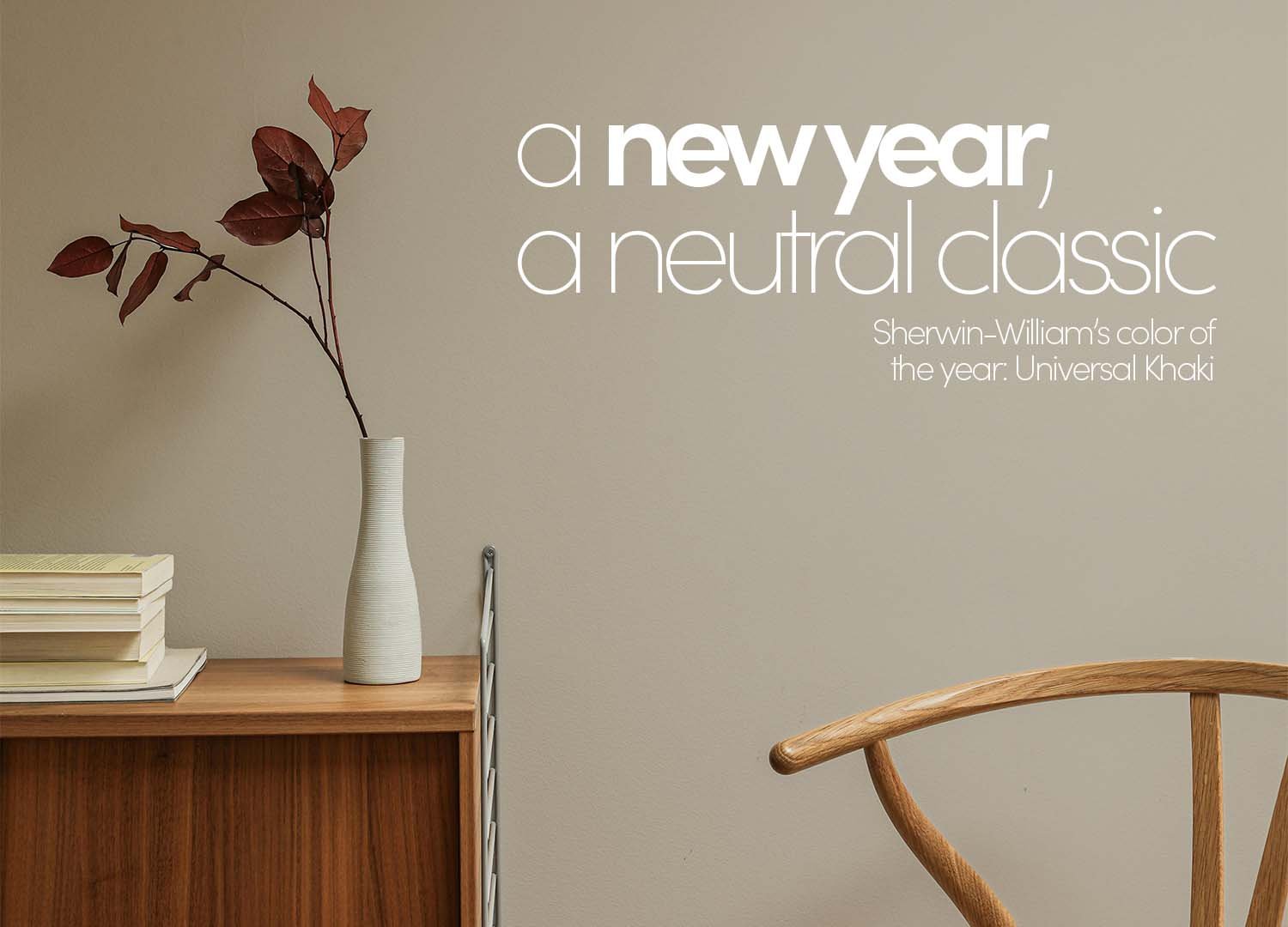
We’re living in an era where adding a “pop of color” has almost become a design prerequisite. A bold lamp, a vivid piece of art, a chair in an unexpected hue — these touches are what catch the eye and give a room personality. But for those accents to truly shine, they need to exist within a space that supports them. They need a backdrop that feels intentional and grounded, a neutral that holds everything together without fading into anonymity.
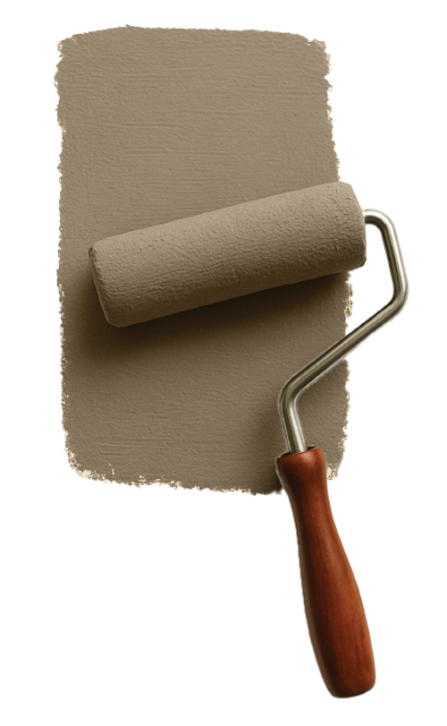
That’s exactly what Universal Khaki, Sherwin-Williams’ 2026 Color of the Year, accomplishes. It’s a shade that embodies balance: calm but not cold, familiar but never flat. At first glance, it reads as a warm neutral, but its subtle undertones give it complexity and dimension. There’s an earthy sophistication to it, a whisper of clay, a touch of taupe, that makes it quietly captivating. It’s the kind of color that makes everything around it look better.
Choosing a wall color is often one of the most defining decisions in a design project. It’s what sets the tone — literally — for everything that follows. The right hue creates symmetry between the colors, textures, and furniture in the room, guiding the eye naturally through the space. It’s an intentional decision, not an afterthought. A good color blends into the background, but it also has presence; it anchors the space, bringing harmony without demanding attention. Universal Khaki does just that, acting as both foundation and frame for the composition that unfolds within it.
Behind this carefully chosen hue is the Sherwin-Williams’ Color Forecast Team, a group of designers, sociologists, and trend forecasters who analyze global shifts in culture, art, fashion, and lifestyle to define the palette that represents the moment. The choice of Universal Khaki signals a move toward timeless versatility in interior design — a reminder that neutral doesn’t have to mean ordinary. It reflects a broader industry preference for adaptable, enduring tones that align
with evolving tastes, proving that thoughtful color can still lead the conversation in contemporary design.